
One of the most common topics you can find on photography forums or Facebook groups is the never-ending “RAW or JPG?” debate. There are those who praise the RAW file for the ultimate quality it delivers, and those who like the more “spontaneous” results straight out of the camera. There also those who happily use both.
OOC JPGs have been growing in popularity recently. Not only have the in-camera image processors improved but brands are also giving you more options to produce better results on the spot. A good example is Fujifilm, whose colour and monochrome profiles, including the new Acros film simulation mode I discussed in a recent article, are among the best you can find.

In truth, Olympus has been pushing its Art filters for many years. They were introduced with the E-30 DSLR in 2008 before being included on every Pen and OM-D camera. However the extreme results they often produce make them more similar to the picture effects you can find on a smartphone app. Ironically, the Art filters are now 8 years old which means they were around when Instagram was but a twinkle in its creator’s eye.
With the Pen F, Olympus has tried to re-invent the picture profile concept by giving you, the user, the chance to create your own colour and monochrome presets in-camera. This time is not about effects: the new Creative modes are for users who seek more subtle and precise results. It’s a different approach and Olympus even incorporated a new dial just for this purpose.
Are the new Creative profiles really worth using? Let’s find out!

[toc heading_levels=”3″]
Ethics statement: The Pen F was loaned to us to conduct our full review. We were not asked to write anything about the camera, nor were we provided any other compensation of any kind. Within the article, there are affiliate links. If you decided to buy something after clicking the link, we will receive a small commission. To know more about our ethics, you can visit our full disclosure page. Thank you!
Preface: what you need to know about the Creative dial and Creative profiles
The first and most obvious thing is that these profiles will only affect the JPGs, not the RAW files. Since they require some patience, trial and error, my suggestion is to select RAW+JPG in the Menu (at least at the beginning). If you are not satisfied with the JPG results, you’ll still have the RAW files as a back-up.
Update: if you use the Olympus Viewer 3 software, you can apply the custom profile you created in-camera to the RAW file. From there, you can make a few more adjustments or switch to another picture profile.
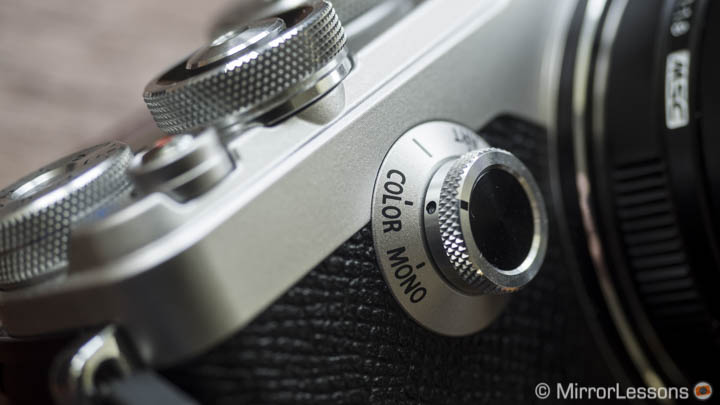
The Creative dial has five steps and allows you to choose between four different creative modes or use the default picture profiles:
- Creative Control
- Art filters
- Picture mode (default picture profiles)
- Creative Colour
- Creative Monochrome
Creative Control was introduced with the OM-D E-M1 – it allows you to change the saturation and hue of your images – and I already mentioned the Art filters. Because these two modes are not new, I won’t cover them in this article.
What interests us are the last two. When you select the Colour or Monochrome option, the camera will automatically display the profile control on the LCD or EVF (you can bring it back at any time with the rear lever).
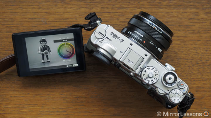
You can change the settings by using the front and rear dial which is quite intuitive and easy to do:
- the colour profile control allows you to vary the saturation of 12 individual colours independently or all together in 10 steps (+5 to -5)
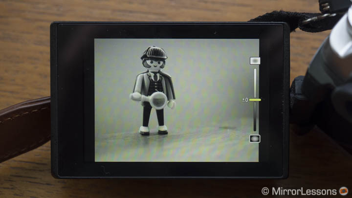
- the monochrome profile control allows you to choose between 8 colour filters and vary the strength in 3 steps.
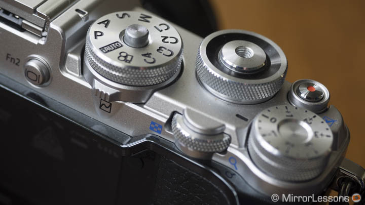
The rear lever under the Mode dial can display additional settings.
With the lever on the rear, you can access additional settings like shadows, highlights and vignetting (the latter for monochrome only). You can also adjust contrast and sharpness via the Quick menu (OK button).
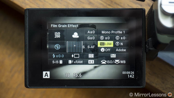
For either the colour or monochrome mode, you can switch between three versions via the Quick Menu. When you turn on the camera for the first time, the first version is neutral while the other two are presets. They all are completely editable and can be reset at any time by pressing and holding the OK button. For the monochrome profile, the quick menu also allows you to select film grain with three levels of intensity.


Note that when the Creative modes are selected, some features of the camera are disabled like multiple exposure or HDR.
The Creative profiles can be used for video too. However the creative dial is not effective when movie mode is selected. You need to adjust the profiles in a still shooting mode (M, A, S, P or C1 to C4), then select the desired colour or monochrome profile in video mode by using the OK button. Note that depending on the profile created, the footage can be noisier.
Creative Color
There are two ways you can use the Creative color profile.
The first is to boost a selected colour or set of colours in a scene to help the eye focus on an object or a specific area of the image. Note that you can’t isolate one colour and make everything else 100% monochrome. It’s not like the partial colour effect you find in the Art filters.
The second is to create a personal colour palette to use for all your images or for a select genre. For example you might want to give priority to the warmer colours rather then the cooler colours for landscape shots or desaturate most colours and increase the contrast for reportage or documentary photography.
Let’s analyse these two options more in-depth with some case studies. For all my examples, I set the white balance manually or chose a pre-set so that the camera’s Auto WB wouldn’t affect the final result. All the images in this article are OOC JPGs.
Case study 1: give priority to one colour over another
This first way of using the colour profile involves making adjustments scene by scene. Unless you are in a controlled environment and know before hand which colours you want to isolate, chances are that you will have to make decisions based on what’s in front of you. That can be a slow process and it includes:
- selecting the colour mode on the Creative dial
- making the desired adjustments with the front/rear dials
- adjusting the shadows/highlights if necessary
- taking the shot
- starting over again for the next composition
To put this into practice, I spent some time in Borth-Y-Gest, a small Welsh village with coloured houses and boats.
In the first example below, the boat has two powerful colours: blue and red. The default Vivid picture profile of the camera would obviously boost both colours. With the Creative colour mode, I decided to increase the red but decrease the vividness of the blue.
- Slide to the left to see the Creative colour profile
- Slide to the right to see the default Vivid profile
[twentytwenty]


[/twentytwenty]
The second example features a nice yellow door. In this case the vivid profile wasn’t enhancing the yellow enough so I gave it a boost with the Creative colour profile.
- Slide to the left: Creative colour profile
- Slide to the right: default Vivid profile
[twentytwenty]


[/twentytwenty]
The bottom line here is that you need to have an important colourful element in your composition that is worth giving priority to.
In the third example starring the same boat seen before, decreasing the other colours except the red makes the boat stand out more in the overall composition.
- Slide to the left: Creative colour profile
- Slide to the right: default Vivid profile
[twentytwenty]


[/twentytwenty]
If you try to distinguish between two elements that have a similar tint, things can become more difficult. In the fourth example, I wanted to see how the image would look with a less intense blue sky. The experiment worked but we can notice a slight decrease in the vibrance of the door’s colour as a result.
- Slide to the left: Creative colour profile
- Slide to the right: default Vivid profile
[twentytwenty]


[/twentytwenty]
Changing subjects completely, I tried to apply a similar workflow to a more difficult subject: a butterfly. I decreased the green tints slightly and increased the warmer colours to give priority to the butterfly’s texture rather than the foliage around it. As you can see the difference is more subtle but the green is less vivid than with the default Natural picture profile.
- Slide to the left: Creative colour profile
- Slide to the right: default Natural profile
[twentytwenty]


[/twentytwenty]
Trying to give priority to a colour like in the examples above is not an easy task and might not be worth the effort.
In most cases, you need to consider the following:
- you will get more precise results by doing the same in post-production with a dedicated software (especially if you work with the RAW file)
- the EVF or LCD screen won’t give you a real perception of how the results will look. Often what I found interesting while shooting turned out not to be so interesting once I saw the picture on the computer.
Case study 2: create a personal look
I found the Creative colour profile more interesting for designing a personal look for your images; something that can reflect your style in a more precise manner than the camera’s default picture profiles.
The idea is to create one to three custom profiles that can be used for specific genres or situations. In this case we won’t concentrate on a specific colour but rather on the overall colour palette of the image.
For the following landscape images, I decided to boost all the warm colours while decreasing the cool ones. This gave the sky less saturation and a warmer look to the picture. It also helped to avoid cooler shadows. However when I reviewed the images on the computer, I realised that I might have de-saturated the blue too much. This shows how difficult it is to get a very precise preview in camera.
- Slide to the left: Creative colour profile
- Slide to the right: default Vivid profile
[twentytwenty]


[/twentytwenty]


I applied a similar reasoning to the butterfly pictures. Because their wings had warm colours, I decided to give the overall image a warmer tone and strong contrast like in the example below.

Another approach can be to de-saturate everything and keep the strength of select colours like orange and red slightly higher. We can then increase the shadows by +4 or +5 to create a “Fuji Classic Chrome” look-a-like profile that can be used for documentary and reportage.
- Slide to the left: Creative colour profile
- Slide to the right: default Natural profile
[twentytwenty]


[/twentytwenty]
This second case study better reflects what you can do with the Creative colour profile. It takes some time, trial and error to find a combination that can suit your taste but it can work.
Creative monochrome
I found the monochrome profiles easier to use straight away.
Instead of dealing with 12 different colours, the main decision here is to pick the appropriate filter for the scene. For example we know that an orange or red filter will darken the sky and create a more dramatic black and white landscape shot. Note that the red filter can often cause the sky to be noisier.
- Slide to the left: red filter
- Slide to the right: yellow filter
[twentytwenty]


[/twentytwenty]
On the other hand, a yellow or green filter can be useful for portraits to keep more details in the skin tones. A red or orange filter would make the face brighter with less detail while a cyan or blue filter can make it too dark.
- Slide to the left: yellow/green filter
- Slide to the right: red filter
[twentytwenty]


[/twentytwenty]
The same reasoning can be applied to yet another butterfly example. The Tree Nymph is white and black species, and as such, the perfect subject for a B&W shot. You can see below how varying the colour filter can have a decisive impact on how the subject stands out from the foliage around it.
[twentytwenty]


[/twentytwenty]
Here as well you can vary the intensity of the highlights and shadows. You can also add vignetting which is something I generally avoid (I am not a big fan of that effect). You can add light or dark vignetting with 5 steps of intensity.
You might have noticed noise in most of my black and white images. That is the film grain effect option, which has been a pleasant surprise so far.
You can choose between three different levels. The Hi level is too strong and invasive for my taste. I’ve become quite fond of the Low and Medium levels. Olympus did a good job of creating something that doesn’t feel too digital and gives an interesting look to the monochrome images.
- Slide to the left: Medium level (100% crop)
- Slide to the right: Off (100% crop)
[twentytwenty]


[/twentytwenty]


The only complaint I have concerns the ease of use of these options.
I wish all the options could be accessed with the rear toggle. I found it annoying that in order to change the grain effect or to switch from profile 1 to profile 2, I had to press the OK button and deal with the quick menu. It adds some extra steps that slows down your workflow. Instead of keeping your fingers in the same position, you have to constantly reposition them.
I also wish that Olympus could make the Creative dial customisable. I’ll probably never use the Art filters or the Creative Control mode which means the dial has two useless positions for me. I would love to assign my custom creative profiles to the dial directly. Imagine switching quickly from one profile to another by turning the front dial. Wouldn’t that be better?
And what if you could just push the toggle on the rear and bring up all the options (and not just half of them) if you wanted to edit a profile? I think that would make the process easier, quicker and enhance the whole experience.
Conclusion: “RAW or JPG?!”
I admit I wasn’t totally convinced when I first tried the Pen F’s Creative dial and the new profiles at the press event. I’m glad I decided to take the time and give it a chance. This is something I could have always skipped with an excuse like “I wouldn’t use them anyway”. But it’s nice to change perspective sometimes.
However, the question remains: are they worth it?
For me the monochrome profiles are by far the most interesting and are also the easiest to use. I like the results in terms of contrast and the look given to the image. The film grain effect is very good if you keep it to the low or medium level.

The colour profiles are trickier to judge. Dealing with colours on the fly is not easy. There can be many variations that influence your decision or confuse you. Taking the time to find your favourite combination and create a personal profile can be worth the effort but you need patience and perseverance. And even though they are easy enough to use, there is room for improvement.

It also depends on how serious you are about using OOC JPGs. The creative colour profile is more powerful than the default picture profile but at the same time, there’s no doubt that you can achieve better results in post-production. If you like the Olympus Viewer software, you can have the best of both worlds but for those who prefer to use another software, it might not be the best solution.
The key here is not to look for “pixel peeping perfection” but rather find a look that satisfies you. The rest will come with the subject, the composition and all the other elements that make a photograph interesting.
Additional note: make sure to leave the Noise Filter to Off. Even though this setting is only supposed to affect high ISO images, it seems to soften the details when using the creative profiles even with low ISO values.
What are your thoughts about the Pen F’s creative profiles? Share your thoughts below!